Universal Games - Website Design

Site Landing page
Background
From a young age I have always been into all things video game related. I love playing video games, collecting artwork and merchandise from some of my favourite games and just being part of the video game community. Since I have started working full time I have been getting my love for video games back even more as I can afford them now. I own all of the previous PlayStations, a gaming PC and a Nintendo switch. My preference has always been to purchase the physical copies of games over digital downloads as I like to keep the boxes and collect them. This way you can also trade the games back into certain shops like CEX for money or other games.
However, with the consumer world leaning more towards online shopping and the COVID19 pandemic preventing people from going into shops to purchase games I have found a huge personal problem with the online stores available to consumers for purchasing games. I find the sites available to be hard to navigate and browse and I often feel like I do not have a good opportunity to view everything available to me. The categories are unorganised and do not make much sense to me personally. I decided it would be a nice project for myself to work on to create a new Video game website. I have a huge interest in a project like this so I believe it will motivate me and keep me interested.
The task
Create a user friendly online store for purchasing video games that solves the problems of its competitors.
Research and Competitive Analysis
Research
The first thing I did was to research the places that you can currently order video games from online in Ireland. There are many options, including:
Gamestop
Amazon
Smyths toys
Littlewoods
Currys
Harvey Norman
Game (if you live in Northern Ireland).
Out of these options only two of them deal are stores that deal mainly in video games, that being Gamestop and Game (in Northern Ireland). Smyths toys is also a good option but bear in mind their selection for merchandise is quite limited as they deal mainly in toys not video games. That leaves Gamestop and Game as the main options as they have a lot of merchandise, the games themselves and also exclusive offers.
Competitive Analysis
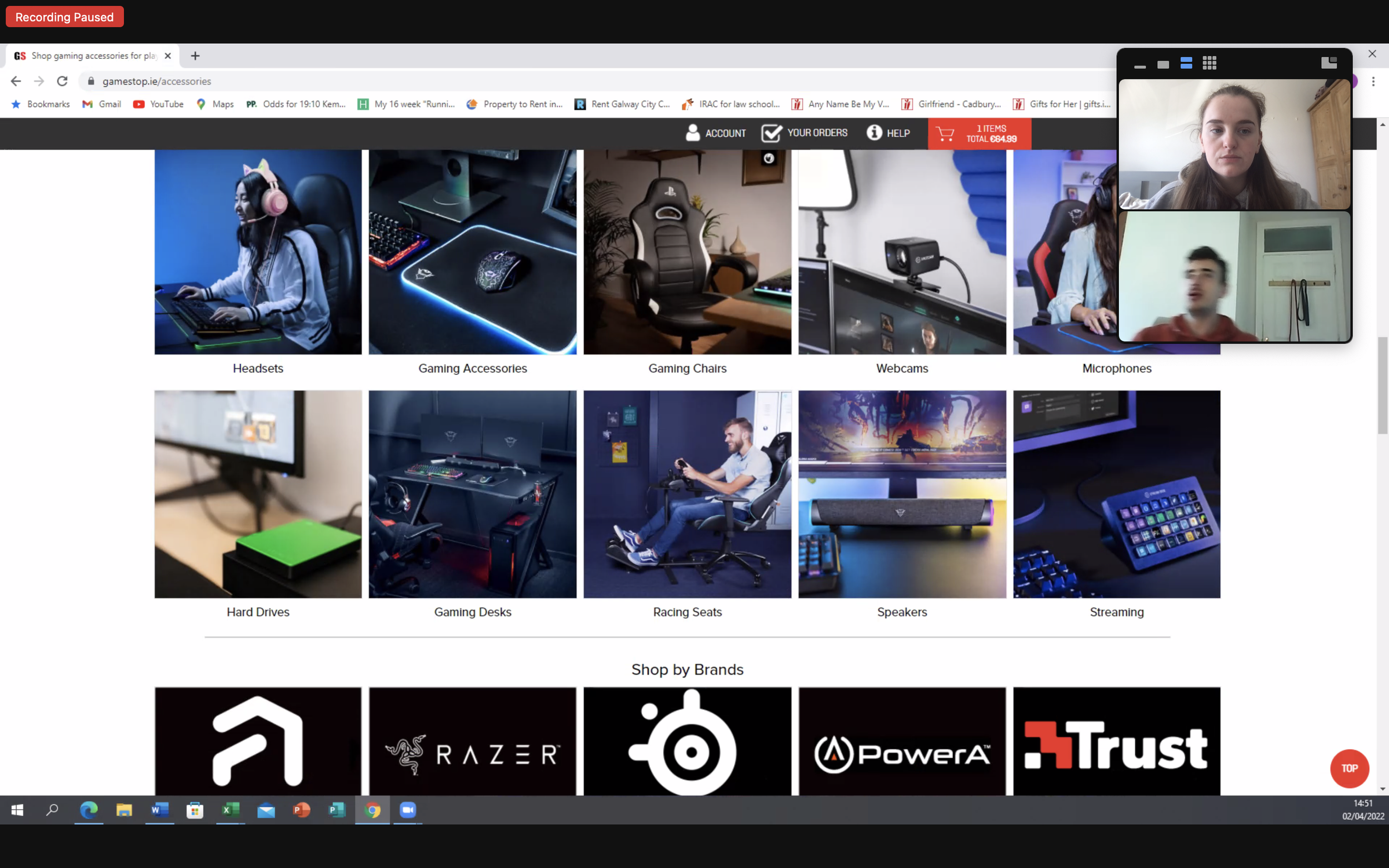
I then decided to complete some competitive analysis on both Game and GameStop websites. I wanted to test the efficiency of the mega menu and filters. To me this is not ideal and does not allow for good browsing. I decided to go through the flow of both from first entering the website via google to checkout. I wanted to get an overview of the pain points that I found for myself. For this I gave myself the goal of:
Adding the newest Fifa game on the PS5 console to the cart.
Adding a schoolbag to the cart.
Navigate to the checkout screen.
No use of the search bar allowed
Usability Test
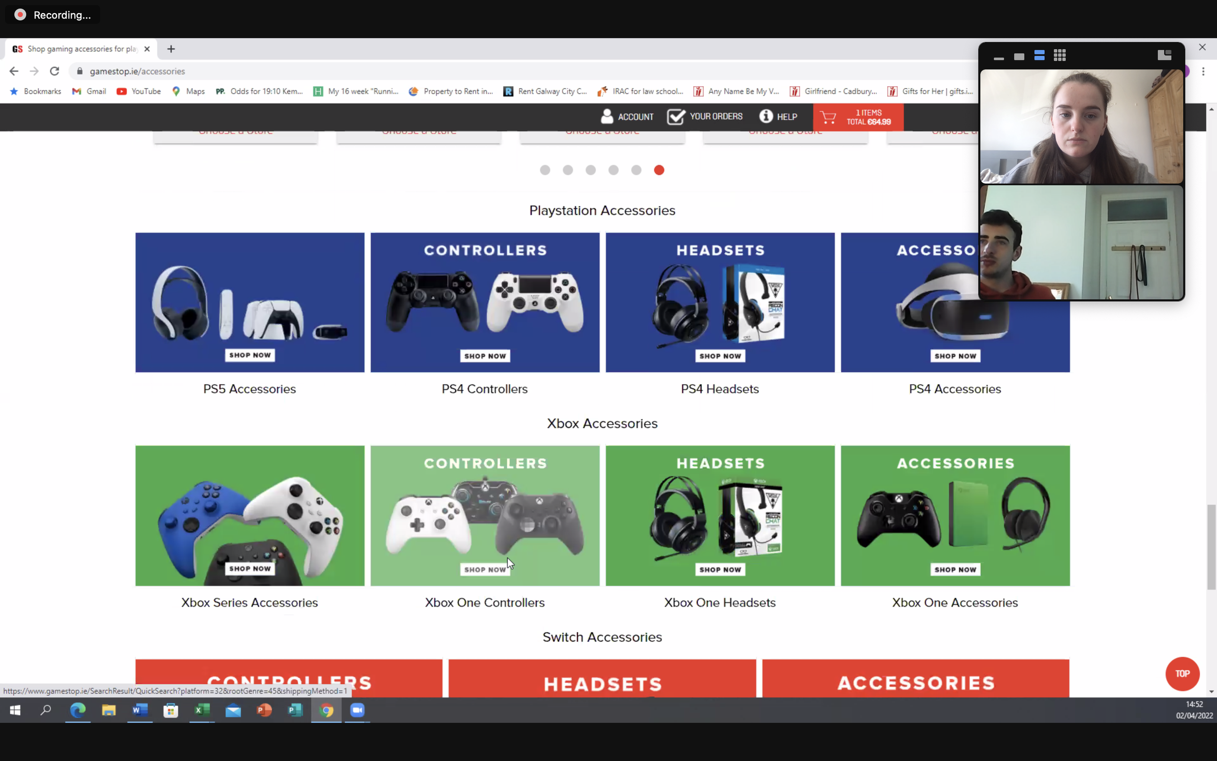
After my own competitive analysis, I recruited a usability test participant to go through the website with the same goals as I had above. I recorded this session on zoom and had them talk through all of the difficulties, issues and positive experiences they had while doing the test. I then rewatched the recording to find the pain points that they discussed.
We went through both websites together and I asked relevant questions about each step to understand the users thought process and why he took the actions that he did.


Pain Points
From my own research and my user testing session I gathered the pain points:
Filtering options are often unhelpful.
Categories are not labelled correctly.
Better overview of what is in each category is needed.
The overview screen can be cluttered and unhelpful.
Often there is too many advertisements for other categories rather than just showing what you are looking for.
Categories are not consistent. Example on Game’s website the options for PS5 and PS4 do not match. There is more available for PS4.
My user testing participant had to give up on locating a bag on Game’s website as the category could not be navigated to in the menu. You can not find this item without using the search bar.
My Solution
What to improve on
From my research there were three main points I wanted to improve on for my site.
Provide a personalised way for users to browse the site.
Improve the mega menu layout and make sure all items have an easy way to reach them.
Improve the filtering experience.
Design
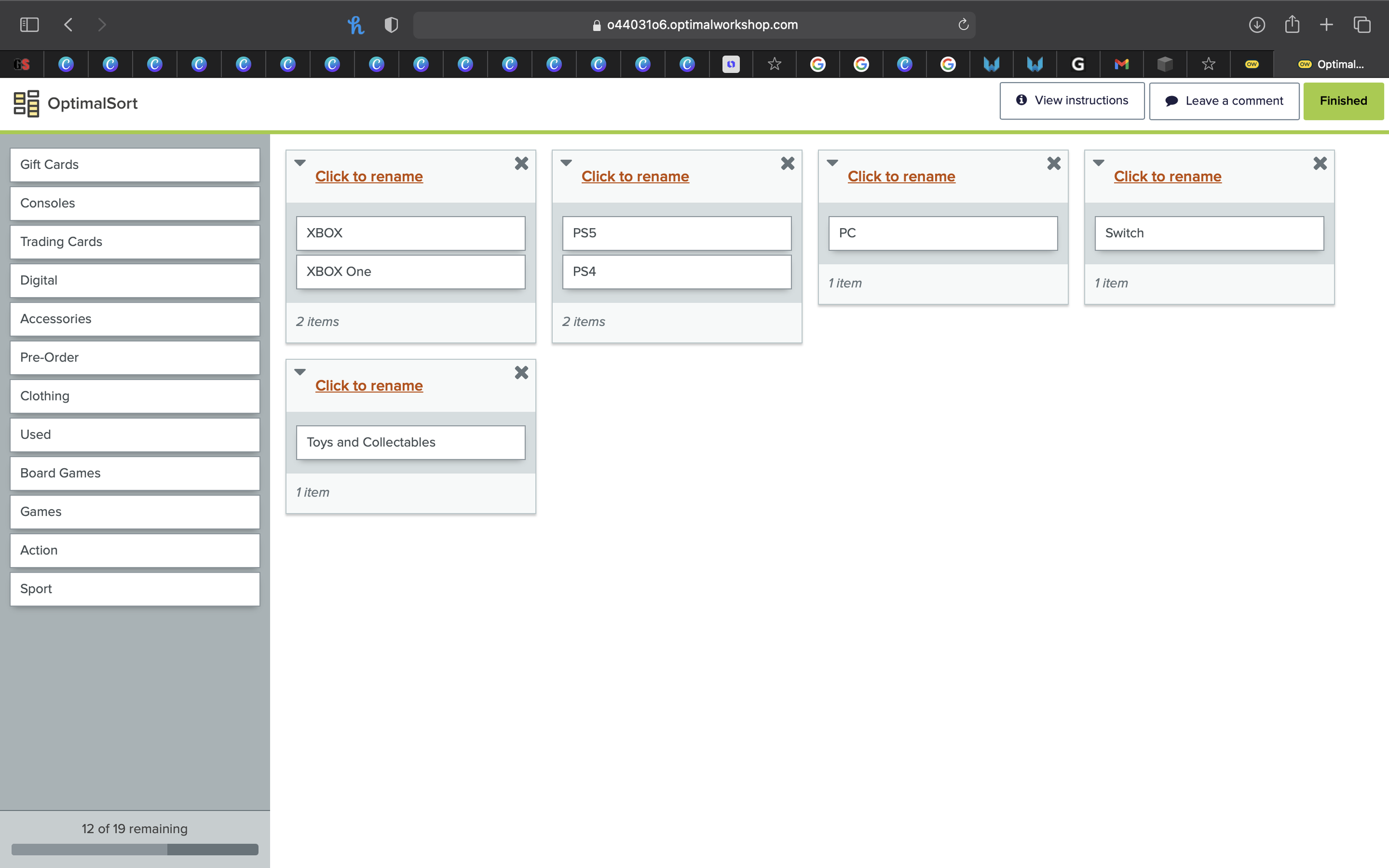
Card Sorting
The first thing I did was to do a card-sorting session with myself and the user I used for my interview. This included writing out each item and category on the website to better categorise and select which items should be grouped with which. To do this I used the site Optimal Workshop. This helped me to layout the mega menu in a way that would be more user friendly.
Low Fidelity/ Initial Sketches

Component
Sample of components created for this project
From here I began to create some initial sketches of each of the features I wanted to improve on as well as the layout of the full site. I tried to create a comprehensive overview of sketches and ideas before I started to work on the features themselves. These helped me to make sure that I did not forget anything when I started to create the more advanced designs.
Medium Fidelity
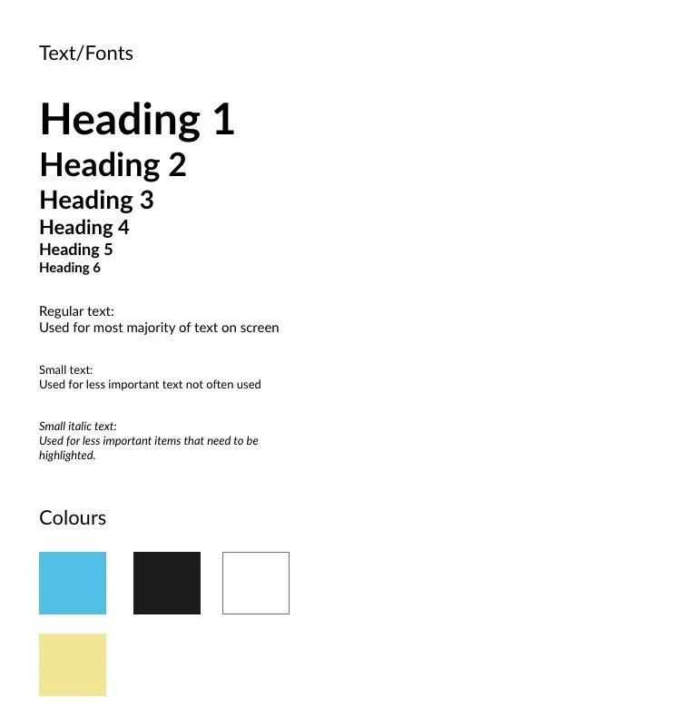
Text/ fonts
All used within this design
From here I began creating the design on Adobe XD. I chose this platform as it is the one I am most familiar with and enjoy the most. At this stage I began to create the components I would need for my design. I created a design library with the theme of the site, the fonts I would use etc. This way when they are placed into my design all I need to do is replace the imagery/script for each component in the final design. I initally started to fill out the empty components onto the frame and added dummy script to text boxes and titles. When I was happy with this I began creating the final design.
Final Design
When I was happy with the basic design I began work on perfecting it. I designed a logo for the site, created adverts to be used in my components and added appropriate branding where necessary. I also added hover effects to items on the sites and began to make it fully intractable.
I created a browsing mega menu item that will allow users to be shown a collection of items that meet the criteria they want. This is different to filtering as it will search the whole site and provide a selection of items from all categories.
You can view the final design here. I will be updating it frequently to add more features and improvements :)