Medium.com Website Improvement

Background
Medium.com is a very well known blog publishing platform. It has users from all over the world. This site allows you to consume and create blogs, stories and articles in any topic you like while also allowing you to have your own personalised profile. I decided to do a study and UX task on this site and see if there were any improvements I could make to it.
The Task
Improve upon the website Medium.com by:
Creating a better user experience for new users
Increasing time spent on the website
Improving the paid user experience
First Steps
Becoming a user and market research
The first thing I did was to research the website in question. As I am based in Ireland I am unfamiliar with this website and had never heard of it until now. I went straight to google and clicked on the website link. I then explored the home-page to see what the website is about and what it aims to do. From this I can see that they are focused heavily on providing a platform for all users to read, learn and write whatever they want, whether they be young, old, experienced or completely new to the blogging space.
From here I created my own account and explored the website as a registered user. I took note of everything that seemed unusual or unexpected to come back to later when designing the prototype. I viewed a few blogs from authors and also explored creating my own story, bookmarked some items and looked through the settings that are available to me with the basic registered view.
I took note of all of the features that Medium.com provides to users as well as comparing the benefits that the paid user receives compared to the regular user. I wanted to compare this website with some of its competitors to get a better understanding of what they are offerring that Medium.com is not.
I then viewed some of the competitors to see what they were providing.
Planning what I would design
From here I began brainstorming what features and improvements would be helpful for me if I were to use this website myself. As I was a new user this was perfect as I could use my own self as a persona. I sketched out all of the areas of interest from my initial research of the website and landed upon three things I believe would help improve and entice me as a user. I decided upon working on the website and not the mobile app.
These are the three main things that stood out to me.
1. There is no real onboarding for a new user. You make your account and land on your dashbaord but here you are recommended items that may be of no interest to you. I do not understand where these recommendations are coming from. I wanted to improve the recommendations and onboarding for new users.
2. I wanted to see an area where you can explore the most popular items of the day in multiple categories.
If people can explore and browse more efficiently they will be more likely to stay on the website.
3. The only real incentive that I can see for paying for the service is viewing unlimited articles. This will not be enough to make new users sign up as they can currently only view 3 per month in the regular service and that is not enough to formulate whether or not they want to sign up. There needs to be another reason to sign up.
Design Process
Feature 1 - New User Onboarding and Recommendation Improvement
Onboarding for new customers is a very important step in my opinion. It is not very clever to assume that new users of a website will know how it works without being shown. While Medium is a moderately simple site to use, one of the first things that I noticed is it provides you with a recommended tab on your dashboard but provides no context as to why it has recommended this to you. This can be confusing to new users as they will be seeing a lot of things that are of no interest to them.
My goal for redesigning the onboarding was to help to get to know the user the first time they arrive and provide them with a personalised recommended section. This will allow them to get straight to reading and consuming content that they want. Personalisation is a very big trend in UX at the moment with compaines like Spotify and Netflix providing users with personalised content and I think it could work well on Medium too. If you can engage newly registered users from the beginning I strongly believe they will be more likely to return to the website.
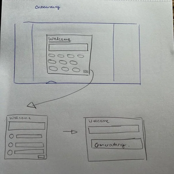
I began by sketching out where I believe this onboarding step could be housed. I settled on having it on the dashboard when a user first logs in. They will see the categories available to them but they will be empty. The dialogue will appear and walk them through the steps they need to complete.
I created the design to match the UI already available on the website. The steps the user needs to complete are to select a few categories and a few authors that they like. When this has been done the website will generate the recommended section and following section for them.
When this is generated they will be presented with the new recommended tab. This allows the user to see a list of recommendations based on what they have selected previously in the onboarding section. For example if a user selected Technology as a category they might be presented with an author who frequently writes within this category, a few stories with the category technology selected and some other tags that relate to technology. I believe this will make users spend more time on the site as they are being recommended a selection of things based on the categories they like and not random stories.
Feature 2 - Trending Section
Next I wanted to rename the current recommended section to 'Trending'. In this section the user can see a view of the articles that other users are currently enjoying. This will mean that the user will always see quality, popular content. This will also expose them to other categories they may not be following.
I believe this will help users to become more engaged with the site, because if they are looking for something new to consume, they can view something that others are already loving. The design for this is the same as it currently is on the live site. It has just been renamed to make it more accurate.
Feature 3 - Improved Exclusive Features for Paid Members
The next part of the website I wanted to improve was the benefits for paid users. Exclusive content is something that a lot of people love to have. I believe if they feel they are receiving extra content from a creator that others are not they will feel closer and more connected to that creator.
My idea is to provide a paid users only section for authors to utilise. They can put up exclusive content which will not be viewable by general users. This would encourage their fans to sign up to the website and thus increase the paid user count on Medium.com. This would appear in the UI as a seperate section in the authors overview that would be locked for un-paid users and open for paid users. In here they can put any content that they wish.
I have also included in my design a place for authors to leave exclusive notes on the articles they create which will also only be available to paid users.
UI Design
When creating the UI I tried to make the design fit in as much as possible with the rest of the website. I designed all UI seen in the video below on Adobe XD. I firstly created the components I would need for the full design. I then created the rest of the screens and interactions. I tried to mimic the current UI of Medium as close as possible to indicate how my ideas could look and could incorporated.