Call Controls Redesign for Cisco Devices
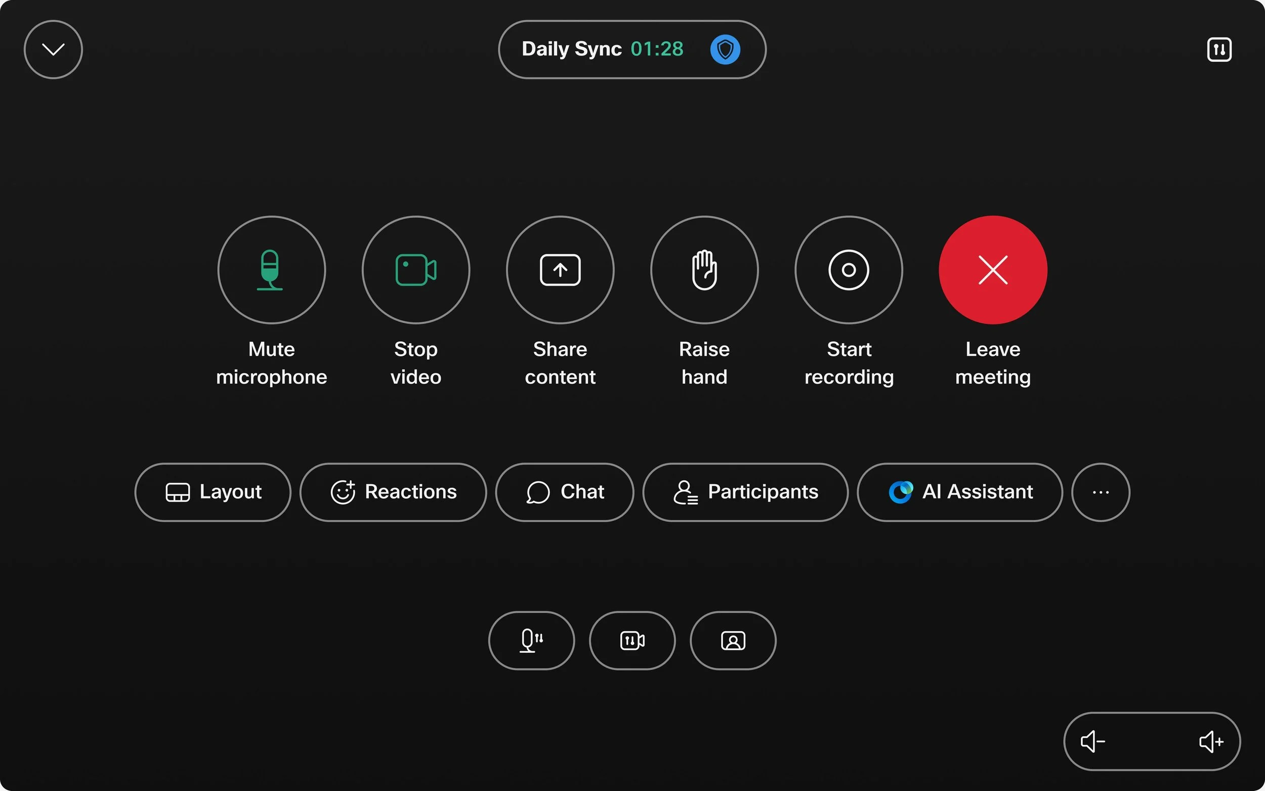
Call Controls on Cisco Navigator. Image taken from Webex Help Center
Please note: Due to company confidentiality, I’m unable to share design files or internal documentation for these projects. Everything you see here; images, GIFs, and videos is publicly available.
As the UX designer responsible for the In-Meeting experience on Cisco Collaboration Devices, to me there is arguably nothing more important to the end user than the call controls. These allow users to control, interact and experience the meeting in as helpful and streamlined a way as possible. This project was incredibly important to me as it is something that every user of a collaboration device will see and use, almost daily in their work lives.
The Task
To overhaul the previous UX experience for the call controls, by researching, testing and understanding exactly what is most important to users to ultimately create a smooth, enjoyable and understandable experience for the end users.
Understanding the use case
In today’s world, especially after the era of COVID19, there has been a huge increase in the number of people working with remote teams, and teams that are based in another location. Because of this, online meeting software has become extremely crucial to a lot of companies. They require reliable, high quality video meeting experiences that also provide them with added benefits that perhaps you would not get in person like AI features or Recording software.
It was from research, customer queries, competitive analysis and my and my teams experience we understood that a refresh was required. We wanted to create a streamlined interface that is easy to both use and recognise and helps to eliminate cognitive overload, whilst also being more modern, organised, and providing users with a hierarchy of what is most important to them within the meeting. This new design also needed to fit into both our room systems that are controlled by a small ‘Navigator’ that somewhat resembles a tablet and also our touch screen desk devices.
It needed to be accessible to all, meet customer needs, fit into the integration of other call types such as Zoom, Google meet and Microsoft teams and also eliminate confusion that some customers had been feeling.
Planning what I would design

Call Controls on Cisco Navigator. Image taken from Webex Help Center
As you can see from the above picture. We have a lot of controls users can have within the meeting. But we also had some metrics available to us. I was very easily able to determine some patterns as to what users were most likely to use in the meeting. As you can imagine, certain things like mute mic and video have higher use cases than some others, so I started from there.
Hierarchy
As it was clear that some controls are more often used than others I began with designing a hierarchy. As we have so many available I decided upon a three tier system.
- Primary buttons would be large and round with 2 lines of descriptive labelling and would be placed on the top line.
- Secondary buttons would be smaller and pill shaped with a smaller icon but again with descriptive text. These would be placed on the second line.
- Tertiary buttons were placed on the third line, a recognisable icon and no text for functions that are more settings based.
- All other buttons would be in the more menu which is accessible from the secondary buttons.
User Testing
Prototype testing
Multiple iterations and designs were created with the goal of preparing a clickable prototype for users to navigate through. I hosted a user testing session with the research team with multiple users of varying technological ability. The goal of this was to understand if users knew where to go when asked to complete a task. I created a set of instructions for them to follow to understand where confusion in the designs was as well as seeing how easily they could navigate and understand the call controls.
Card sorting
From the metrics available to me I could see a pattern in the most used controls but I wanted to fully understand what was most important to each user. I created a card sorting user testing session with test participants where they allowed me to gain insight on what the most important controls were to the users. This allowed me to make changes to the hierarchy to fully align with users needs.
Finalising Design
From the insights gathered from the user testing sessions I was able to finalise the design. This involved involving all stakeholders and engineering teams and talking them through the vision and iterating with them. I like to do this before engineering work begins, to allow them to ask questions and gain insight into where trouble may be in terms of coding it. From here we worked out that every control should have a fixed place, we also worked with other teams on creating a design that allows for custom buttons to be added.
This was a huge project for my whole team as it was a major, major redesign of something that is so often used by our customers. It was something that had been worked on from my side for over a year but the results and feedback we received made it all worth it.
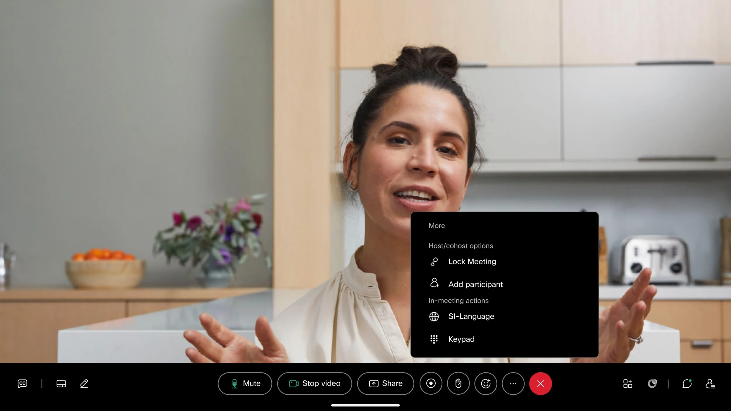
Call Controls on Cisco touch device. Image taken from Webex Help Center