Spotify Case Study & Redesign
Aim of this project
The aim of this project was to test my design skills and redesign one of the most famous apps on the market. This is a project designed purely for fun, to do in my spare time that I hope will enhance my wire framing and UX process Skills.
Resons behind CHOOSING spotify
There are many reasons I have chosen to redesign the Spotify application.
It is a application that I use nearly everyday myself and have spent a lot of time looking at
It has millions of daily users who love it
There are aspects of this app that I myself find confusing
There are many things that I love about this app and would like to improve upon
The process
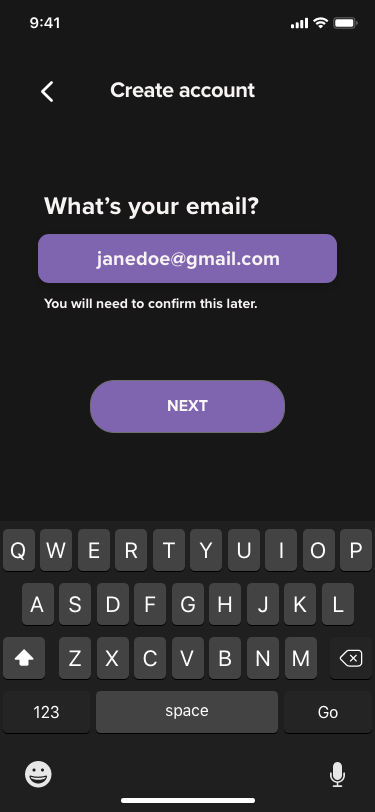
The first thing I did in this case study was redesign the logo. I myself find the green colour of the Spotify logo to be very harsh and glaring. From the below image you can see my redesigned logo. I chose to use a purple, blue, white and black colour palette for my redesign.
The main reason that I chose purple is that it is a calming, creative colour which I also felt stood out well against the black and white contrasting colours. This was designed using the Spotify logo downloaded from their collaborators page and editing it in photoshop. I reduced the brightness of the colour and included a gradient in the logo symbol.

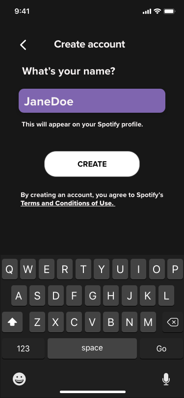
UI Design
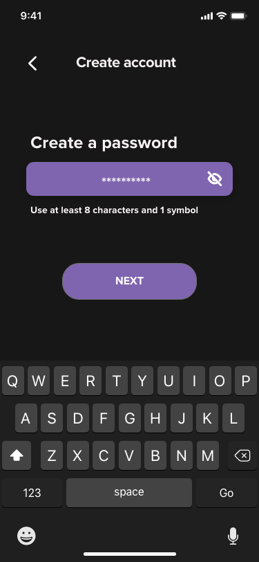
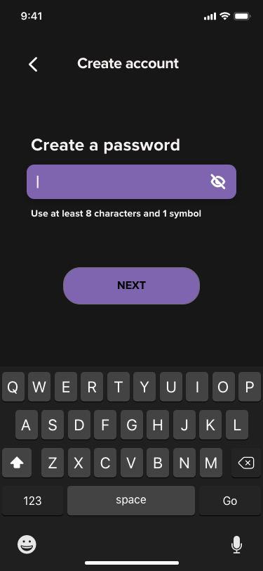
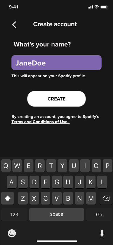
When creating the UI on Adobe XD, I wanted to start from scratch. I have created the app from the very beginning including the I-phone Lock, home screen, app widget, home page of the application itself and the new user onboarding screens.
Here you can see the integration of the new theme colours. In the original application the text field, create & next buttons and text were all black and grey. You can see here how the purple contrasts well with the black and white.